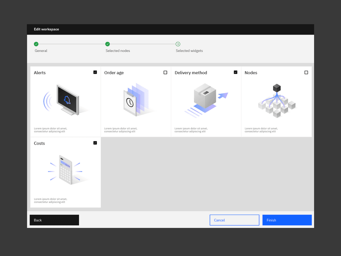
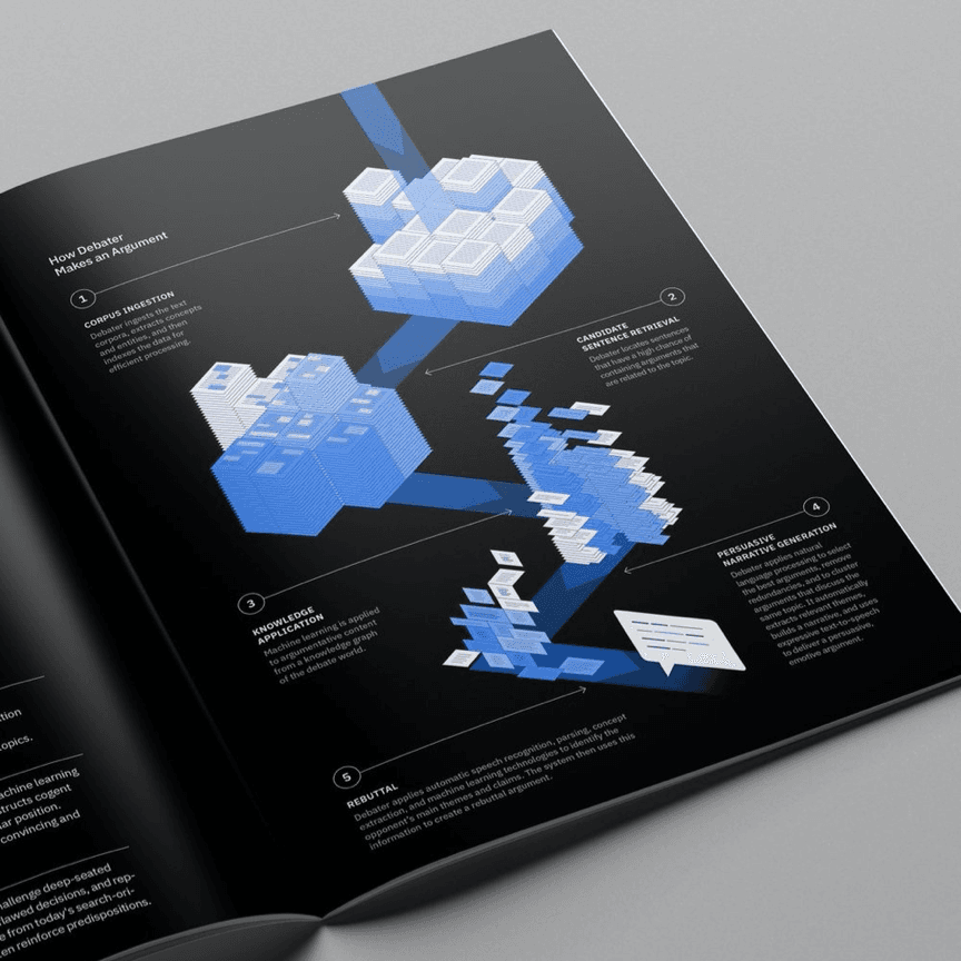
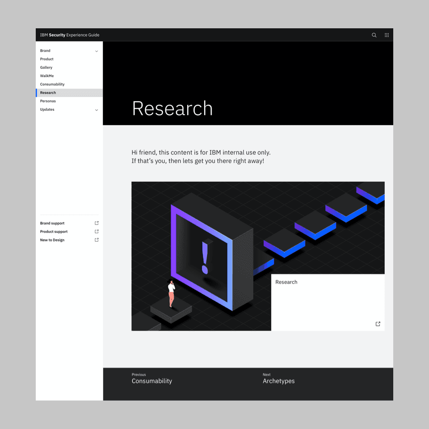
Isometric style
Our isometric illustration style does a lot of heavy lifting when it comes to communicating rich ideas. Use its architectural foundation to express spatial concepts. Careful use of animation with isometric style creates dynamic illustrations of environments, objects and concepts.
Examples in use


Animation
The isometric illustration style brings a completely unique set of characteristics that makes animation a distinctly different challenge. The illusion of depth opens up a wealth of new storytelling options, but care must be taken to maintain perspective, and animate with a more physical sense of cause and effect.
Tips
- Maintain perspective when animating forms that are extruded or otherwise depict volume in the original design.
- Use rotation selectively as a way to add interest, delight or highlight elements of significance.
- Animate to convey weight, mass and precision to emphasize and support the physical, volumetric nature of the style.
- Ensure that shadows accurately react to the movement of the objects casting them.
Maintaining perspective
Translation
It’s incredibly important to follow the IBM isometric grid in animation, especially when moving objects in space. Objects that don’t behave in accordance with the 30° incremental angles of their construction immediately break the illusion of space in this style—elements moving in arcs or diagonally will quickly break the illusion of space and depth.
Translate objects along the isometric grid on one axis at a time.
Avoid overlapping movement on multiple axes simultainiously.
Rotation
Rotation can be selectively added to individual elements as an avenue to create delight or add interest. However, rotation should only be used if it adheres to the same rules as 2D objects, applying it to one axis at a time with little to no overlap.
The animation of each element should typically be treated as you would a purely 2D object, although some designs may lend themselves to more subtly volumetric and complex animations, such as simple rotations and oscillations.
Keep rotation to one axis at a time.
Avoid overlapping rotation on multiple axes simultainiously.
Camera
Maintaining the angle of view in an isometric world is extremely important. As such, the camera should remain locked in place at all times, to not break perspective. Only on very rare occasions should the construction of a scene accommodate highly controlled, systematic repositioning of the camera.
Lock the camera to an isometric angle.
Avoid changes in perspective.
Light, shadow and gradient
Light, shadow and gradient—where possible—should be defined in 2D, not baked onto 3D surfaces as textures. If more complex objects are required, creating mattes in a 3D package to accurately depict rotation on an object is the preferred technique for elements that are brought into a 2D package for animation.
Even though it presents the illusion of a third dimension, isometric style is still typically produced in 2D and should be treated as such in motion. Animate the movement and rotation, and their corresponding shadows, as you would 2D shapes.
Add color and gradients in 2D.
Avoid baking gradients on surfaces in 3D.
Physicality
The introduction of volume creates a whole new avenue to create interest. However, achieving compelling performances in this perspective requires a greater emphasis on physically believable motion. It’s vital that we communicate a sense of mass, weight and momentum, as viewers instinctively expect an object to move in a natural manner—which is something our animations should attempt to capture.
Animate with weight and momentum.
Avoid unnatural, exaggerated movements.


