Overview
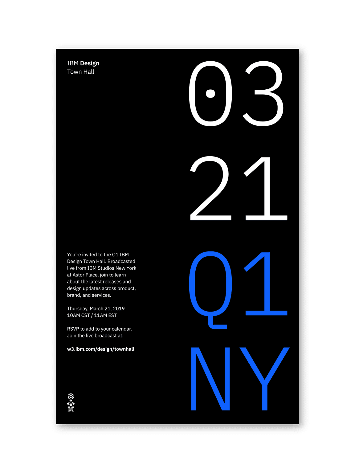
The layout is where all the elements of communication come together. A good layout requires careful planning and use of composition, which relies on principles such as hierarchy, scale, proportion, contrast, harmony, rhythm, repetition, and many more.
Point-of-view
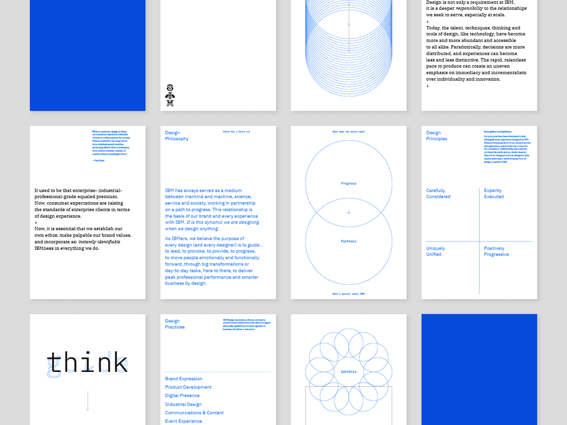
When it comes to expressing our brand character, perhaps what’s more important than our elements is how they all come together. Layout is the way that each element is arranged in a given space, and careful consideration of it is essential to achieving the IBM look.
While our look has evolved and will continue to evolve, what defines it is our approach to design—our philosophy, principles, and quality of craft. And it is the responsibility of every designer at IBM to uphold.
When practicing layout and composition, certain criteria should be considered to express our distinct point-of-view. While the aggregate of IBM communications should employ the following design characteristics, individual designs need not feature all equally.
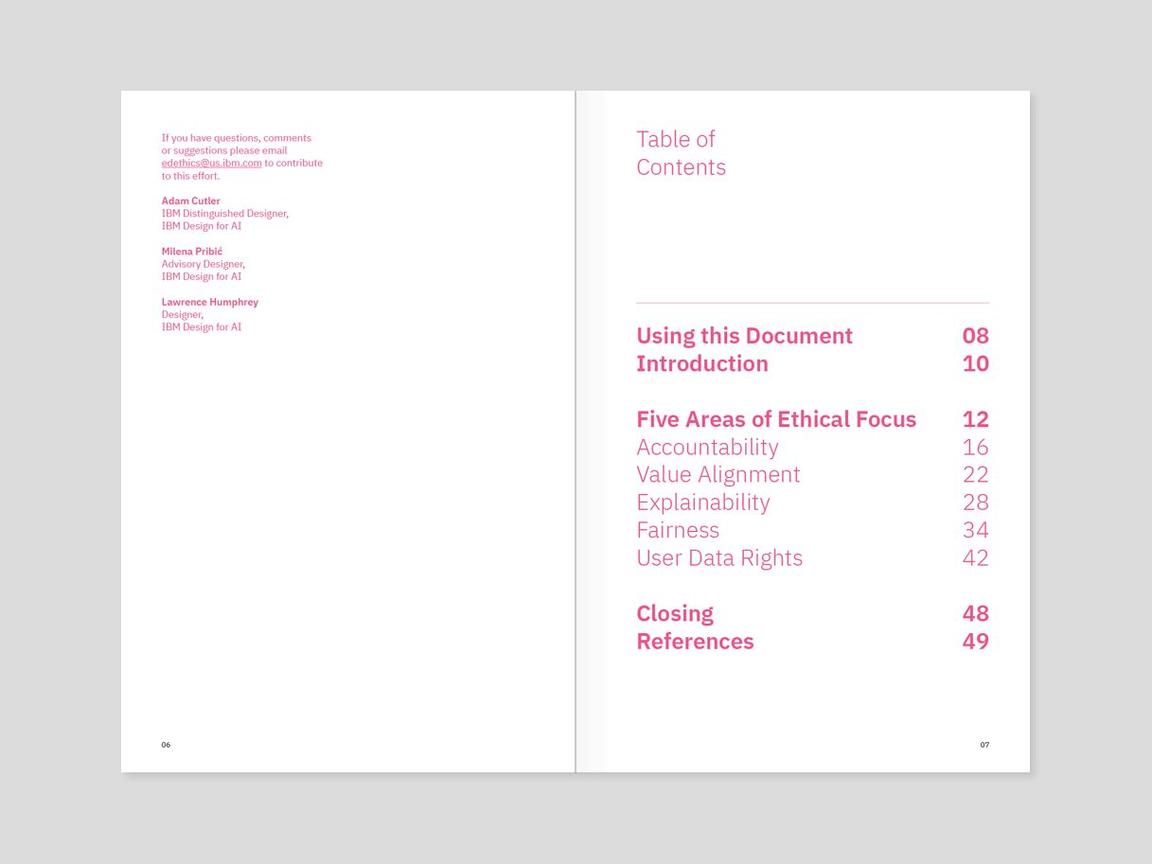
Our purpose is to be essential to our clients and to the world, and that should be expressed in every experience we create. Achieving a successful layout starts with essential content strategy. That then informs how to best create an essential layout or composition. Providing a user with both the most vital and digestible content in an organized fashion helps establish hierarchy and creates a meaningful experience. Being essential in layout and composition helps ensure our content can be understood and useful to our audience.
- Form follows function. Nothing is gratuitous or there for decoration.
- Ample negative space opens up the design.
- The message or goal of the design is clear.
- Structure is as simple as possible until additional complexity is needed.
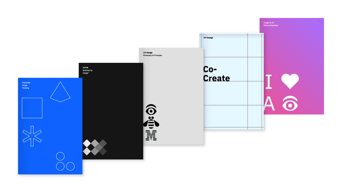
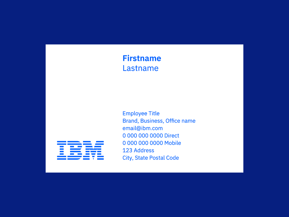
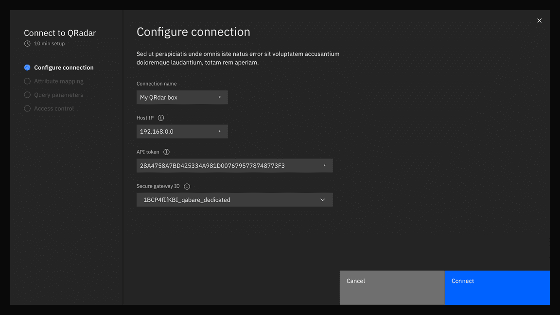
At IBM, we continuously adapt to the evolving needs of our clients to solve the world’s toughest problems. This dynamic quality is expressed in layout through asymmetry, contrast, and the suggestion of movement and energy. Thoughtful, creative relationships among elements create unique visual experiences that provoke thought and engagement.
- Positive and negative space work together in asymmetric balance.
- Asymmetric layouts help create qualities of space and depth.
- Compositions elicit a sense of movement and vitality.
- Expectations are broken with surprise and delight.
- Experimentation and playfulness are apparent.
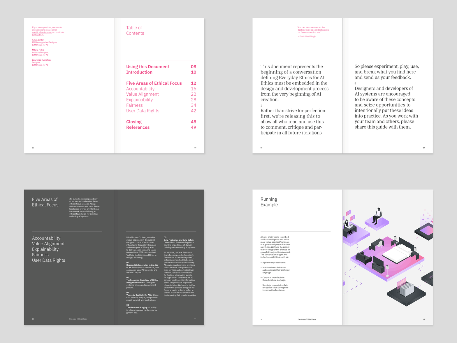
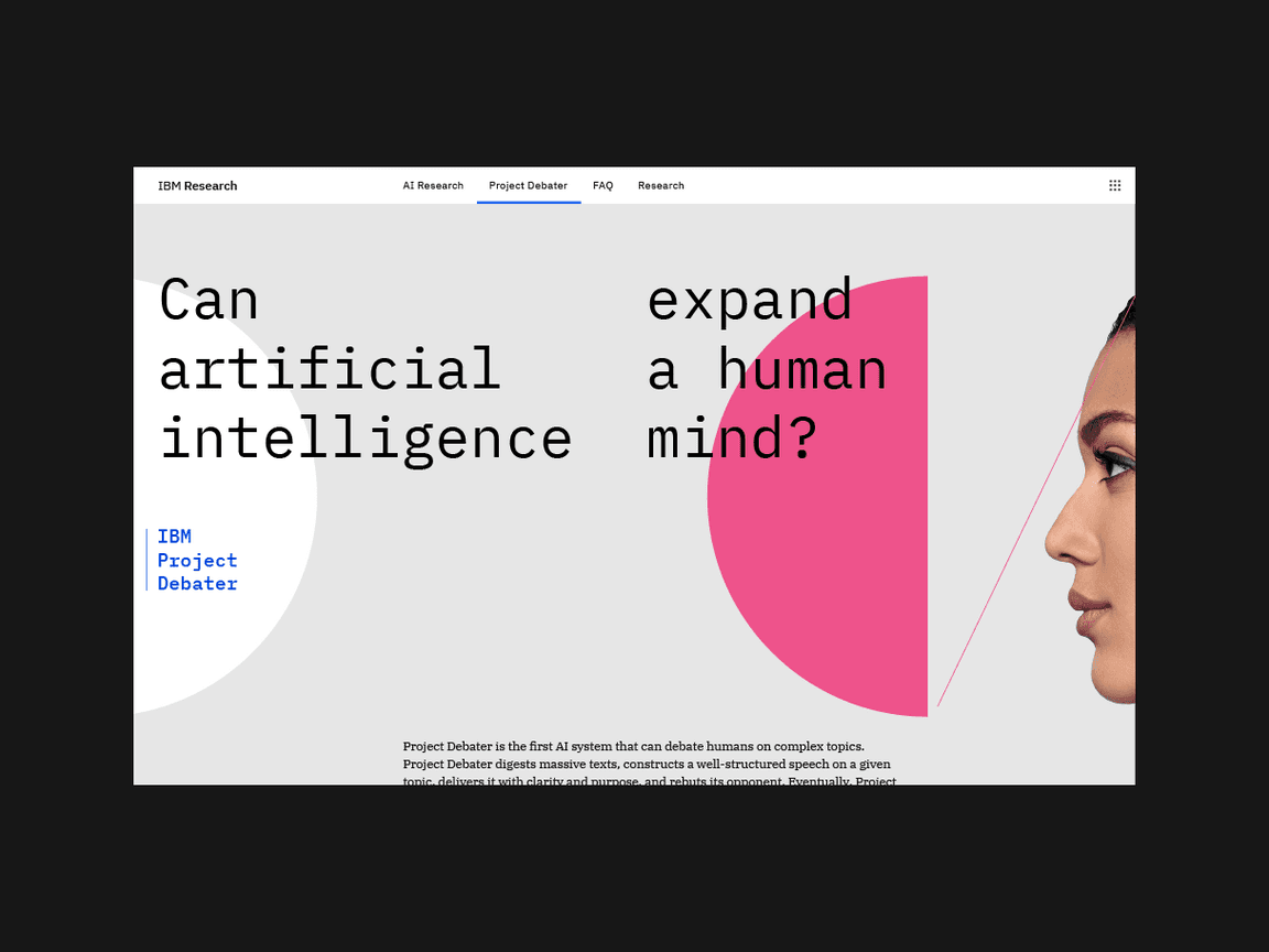
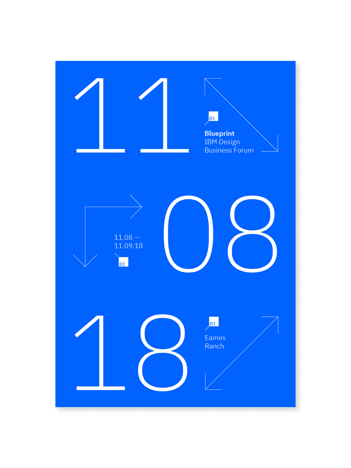
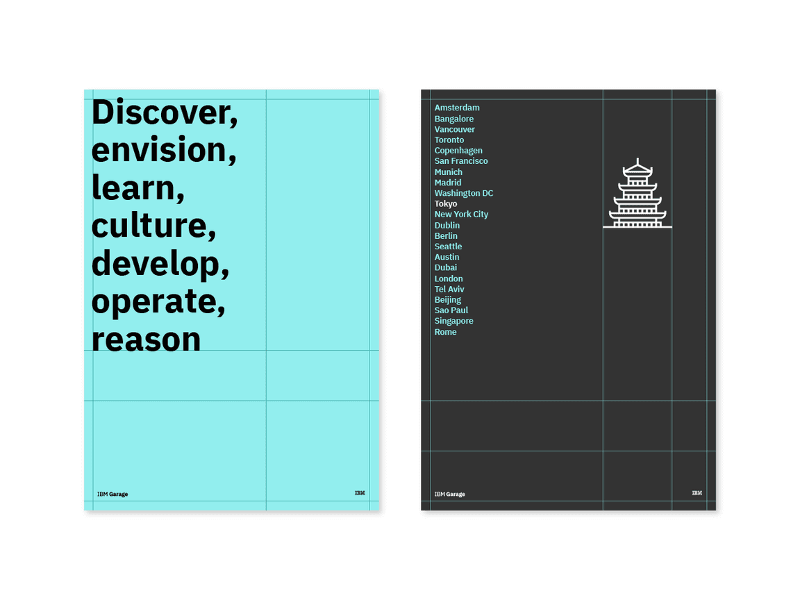
Engineering has always been a part of our DNA. Whether it’s industry-leading technology or a layout for a magazine, everything we create is crafted with expertise. An engineered quality in layout is achieved primarily through systematic logic. This means that nothing is placed, sized, or styled without reason, and there is consideration of the relationships among the parts and their contexts to the bigger picture.
- Nothing is arbitrary; all decisions are made according to systematic logic.
- Elements are aligned to each other as well as the underlying grid.
- Aesthetic is delicate, precise, and based on geometry.
- Measurements, shapes, ratios, and proportions are repeated for consistency and quality.
