Line style
Line style is the most basic and immediate type of illustration at IBM. Line style illustrations use a very limited set of line weights, a 4px grid and simple color rules. Please consider the following guidelines when crafting line style illustrations.
Resources
We’ve built an Adobe Illustrator starter kit you can use to accelerate your proficiency in building compelling, on-brand illustrations. In it you’ll find foundational grids for line style illustrations, guidance on the underlying anatomy of the style and a fundamental set of simple elements you can use or recombine to form your own new illustration narrative. The kit includes an inspiration gallery of examples showing techniques you can use in this style. These examples aren’t a library of ready-made art; they’re solely provided to help inform your explorations. Use them to study and deconstruct the technical aspects of this versatile style.
Examples

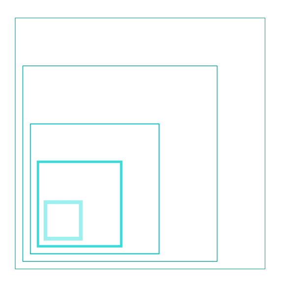


Lines
As the name suggests, the line style uses lines to draw everything. It’s all about the precise nature of the line and its overall lightness. The lines prescribed in the system use a simple logic that works well with the 2x Grid and helps maintain consistency across the IBM brand.
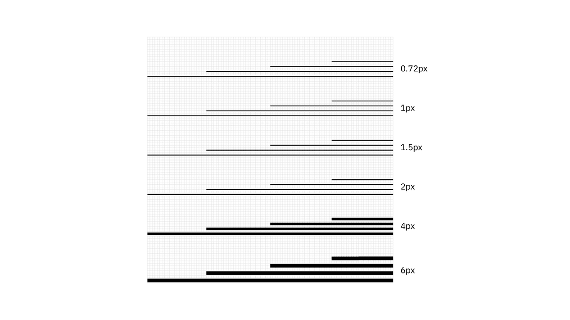
Mixing line weights
Mixing line wieghts in an illustration is acceptable as long as you don’t use weights that are too similar. It’s also recommended to use no more than four weights within a single illustration.

Do mix line weights that have clear purpose and distinction.
Don’t mix line weights that are too similar.
Spacing
It’s very important to have the appropriate space between different line weights. Here’s a guide to follow.
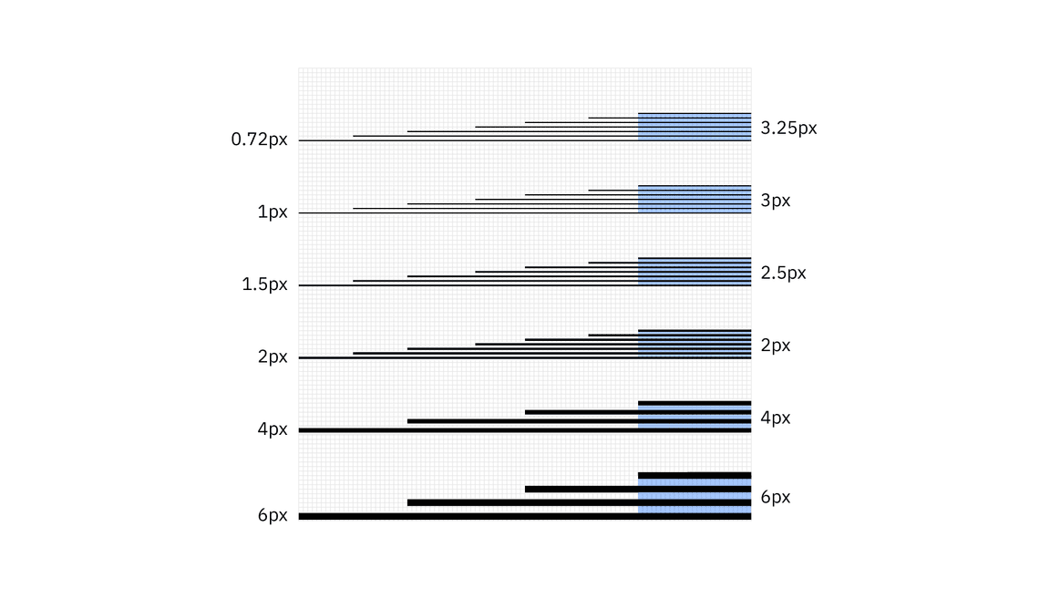
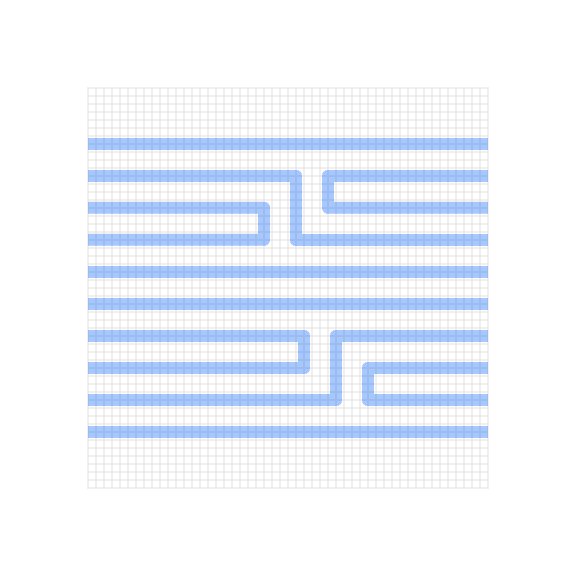
Do use line spacing greater than or equal to the line weights being used.
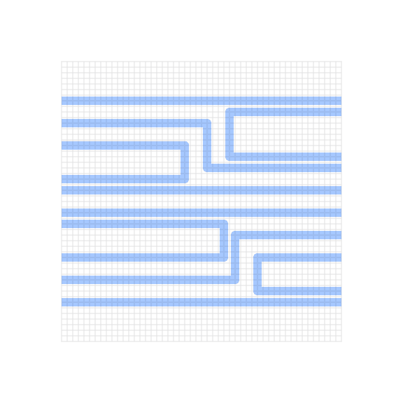
Don’t use line spacing smaller than the line weights being used.
Grid
Building off of the 2x Grid, the line style grid has been optimized to help craft engineered executions of line work. Since line style illustrations may require very fine detail, a 4px grid system was chosen as the base unit. The 4px grid should be used for all canvas sizes. This method will ensure that your illustrations don’t become overly crowded or busy.

Snapping to grid
Line style illustrations should be constructed using the “snap to grid” feature in Adobe Illustrator. This setting ensures that the points along your drawing can snap to the grid lines underneath your line work. The grid positioning of the line gives the precise and engineered aesthetic that’s vital to any IBM illustration.
Do make sure the anchor point lands clearly on intersecting grid lines.
Don’t forget to use “snap to grid,” or it may result in misaligned anchor points.
Drawing
To keep your illustrations following an engineered and simplified aesthetic, please stay away from complex Bézier curves and arbitrary curvature unless the idea or metaphor requires it to communicate clearly. Angles, curves and rounded corners should be built using the grid and basic geometries as much as possible.

Angles
Please use standard angles—15°, 30°, 45°, 60°, 75° and 90° are preferred. Using these standard angles will help your illustrations appear consistent. Although you can use any angle, we recommend sticking with the standard angles suggested here.
Circular curves
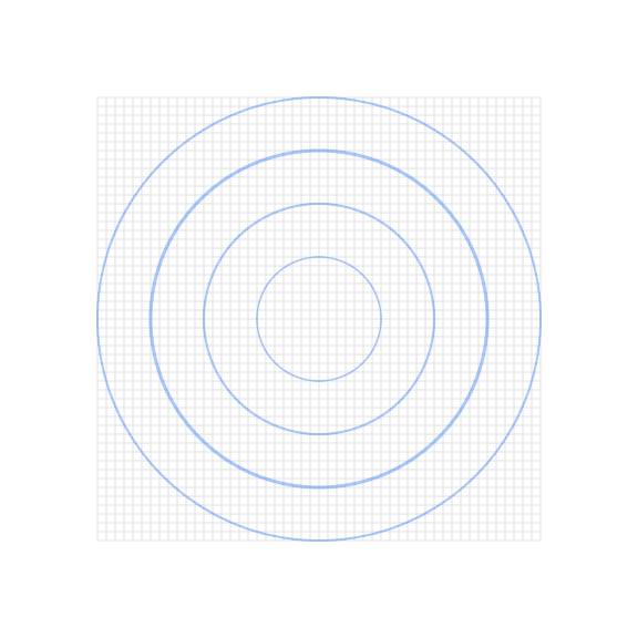
Create curves using the grid as your guide and use quarter circles, semicircles and full circles whenever possible to achieve pure and simple curved shapes. Following this guidance will help ensure the engineered aesthetic.
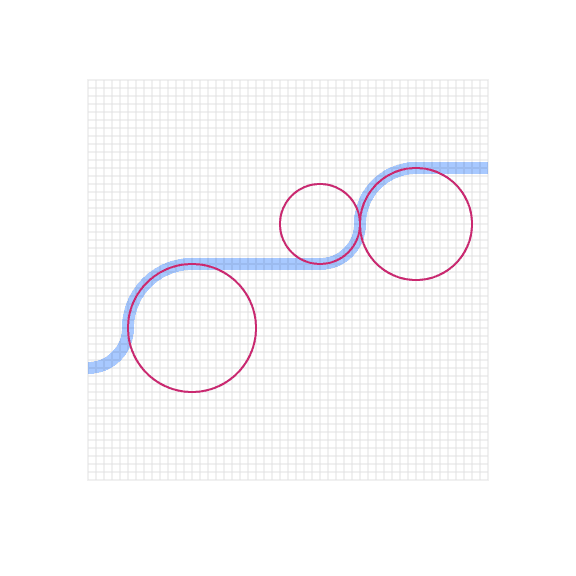
Do use clear and regular curves when possible.
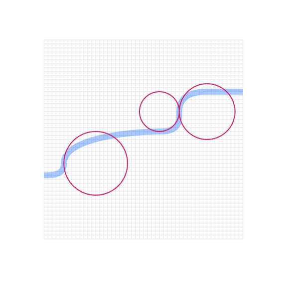
Don’t use irregular curves if they can be avoided.
Organic curves
Organic Bézier curves may be used to add more realism and character to your illustration, but should be used intentionally and with precision. Basic shapes should always lay the foundation and be used to ground the more irregular curves.
Rounded corners and nesting
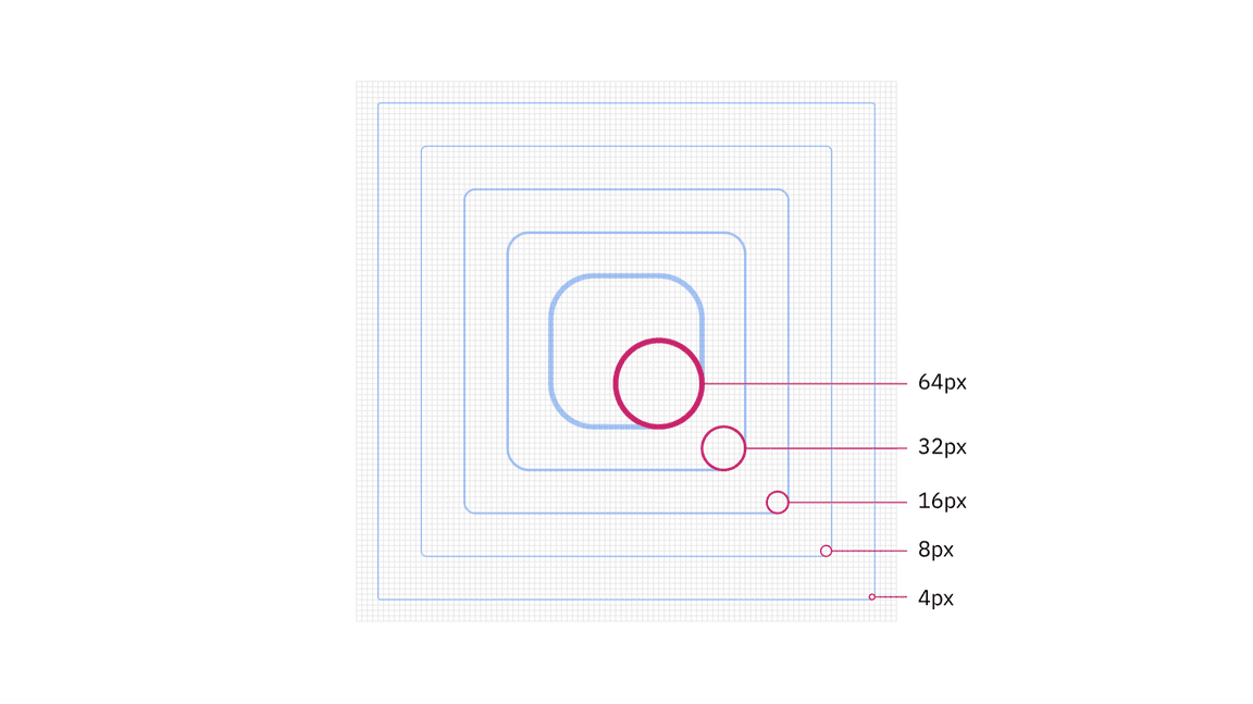
You can round the corners of angles in Adobe Illustrator for a fluid and controlled look. Here are some specifications to use when applying a radius to your object.
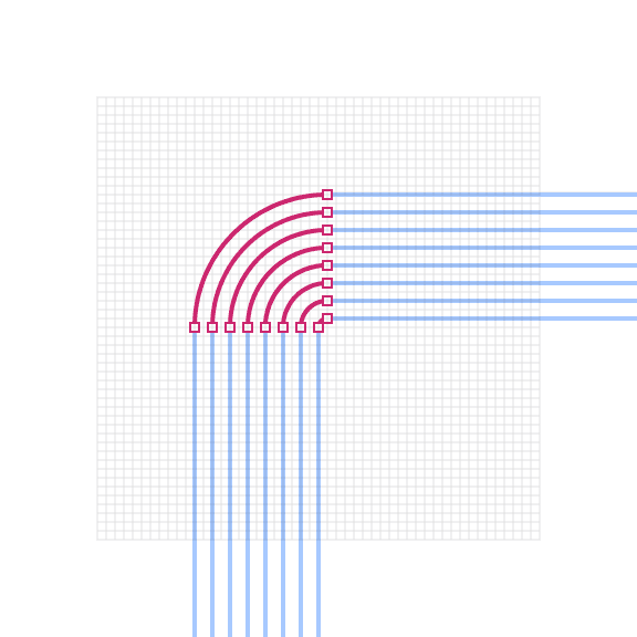
Do equally space nested lines with increasing radii.
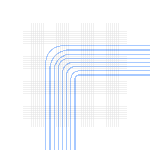
Don’t use different corner radii when nesting lines.
Color
Each illustration style has a slightly different expression of color based on the characteristics of the elements being used. Stroked lines, for example, have the unique quality of allowing gradients and transparencies to follow the path of the stroke. For general approaches to color, please visit the illustration tips and techniques page.
Gradients
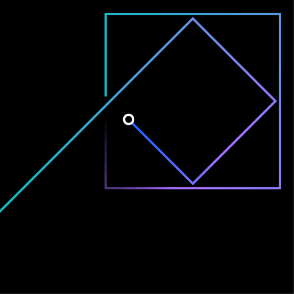
Gradients can be an effective way of adding more fidelity to your linework by implying depth, dimension and movement. For best results, apply the gradient so that it follows the path of the stroke.

Transparency
In most cases, it’s recommended to use opaque lines and avoid the use of lighting effects, such as transparency and multiply. This technique helps ensure consistent colors across all our illustrations. Transparency effects can still be implied by carefully selecting sequential swatches from the palette or by using gradients where one of the swatches blends into the background.

