Tips and techniques
When choosing or creating an IBM image, certain criteria should be considered. The following guidance will help achieve the effect and impression we’re looking for.
- Perspective
- Composition
- Aspect ratio
- Lighting
- Depth-of-field
- Effects and filters
- Clichés, metaphors & see-say
Perspective
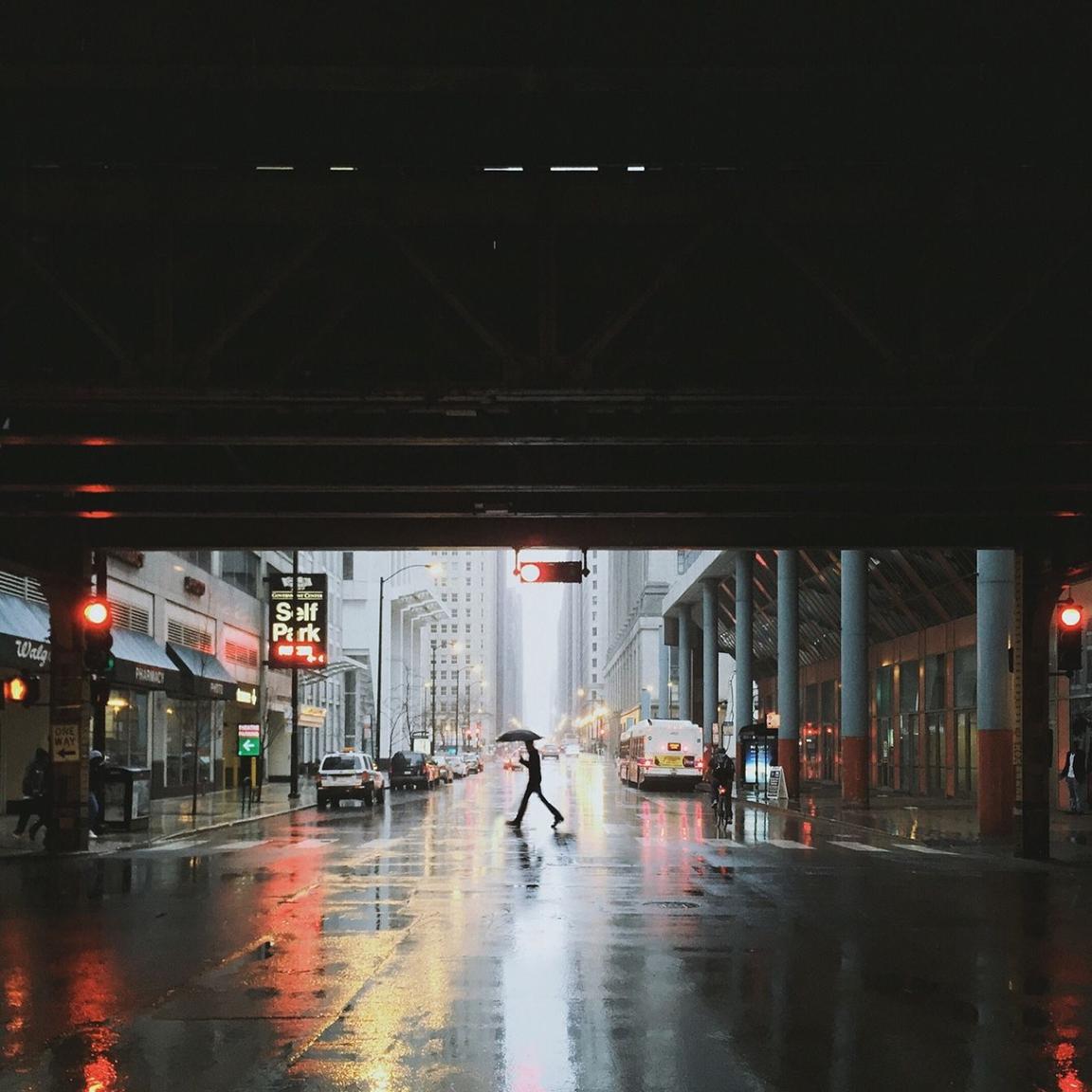
As IBMers, we are objective observers of the working world. This translates into the perspectives we commonly use in photography. There are two primary viewpoints, each deliberately designed to present the world “as-is” and at its beautiful best.
Eye level
We are a forward-facing organization. We treat our clients and ourselves as equals. Imagine IBM or an IBMer is the camera, this is how we view the world around us; authentically, eye-to-eye, fairly, naturally, truthfully. We take a step back, capture context, observe the environment, and present a bigger picture.

Aerial
Used less often, another angle we take is to offer things from a different perspective. Equally as objective, an aerial view allows us to “elevate” our observations. This communicates a certain “eye” on consequences and impact at scale.


Avoid forced perspectives that attempt to add interest to uninteresting subjects.

Avoid perspectives that are neither overhead or at natural eye-level.
Composition
Image composition is the intentional arrangement of individual subjects within a scene to form the final image. There are two key aspects to composition that you should consider for every image.
Framing
The 2x Grid can be a useful guide when thinking about composing imagery and positioning subjects. Images should leverage divisions of two. Either horizontal or vertical, these divisions create zones for subjects, allowing for carefully considered compositions that feel kinetic, like moments in time.
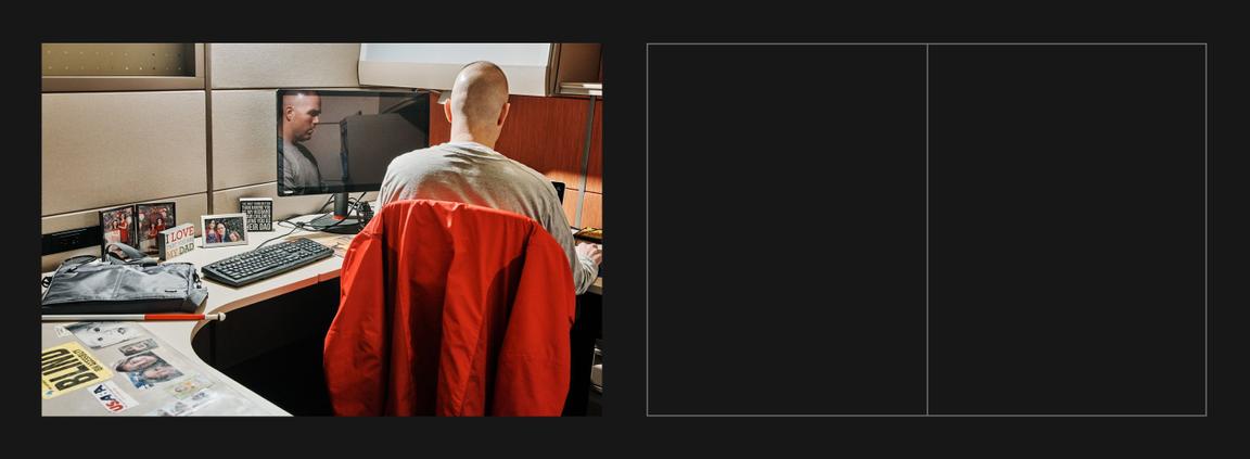
Vertical

Horizontal
Focal points
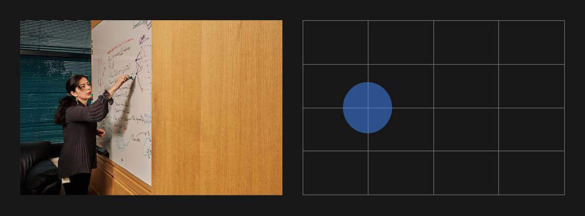
Use the 2x Grid to establish clear focal points. It may seem prescriptive, but when seen together this approach acts as connective tissue between IBM images. The same approach is used to create delightful film experiences.
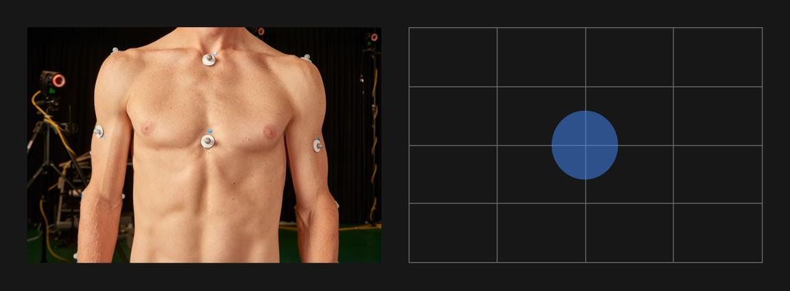

Avoid having no center of interest and drawing attention to an empty center

Avoid conflicting focal points and no clear alignments to a grid
Aspect ratio
When cropping images, use a common 16:9, 4:3, 3:2, 2:1 or 1:1 aspect ratio unless otherwise specified for a particular format. These common aspect ratios work well with our 2x Grid foundation. They help create a visual rhythm within everything created using IBM Design Language—from UI components to signage, event spaces and beyond.

Lighting
Whenever possible, use natural light or techniques that simulate natural light. IBM imagery is allergic to artificiality. The sincere portrayal of subject is paramount. We cannot manufacture a better reality than reality itself.


Avoid overly warm, glowing, or “golden hour” photographs

Avoid color washes and grading
Depth-of-field
Everything should be in sharp focus. This crisp approach reinforces a deep interest in everything, and an emphasis on context and detail. Everything is presented evenly.


Avoid images with soft focus
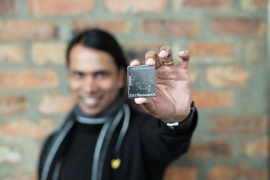
Avoid images that fall off focus too quickly
Effects and filters
Avoid anything artificial. We’re a fact-based company. We communicate with clarity, and our photography should communicate this too. We avoid hyperbole and jargon. Our imagery should avoid spin and overstyling as well.

Avoid images with added glare or elements that have been clearly added via photoshop

Avoid images that have color or image overlays
Clichés, metaphors & see-say
When it comes to photography, people respond to what they don’t see as much as what they do see. Too often, imagery is used to double-down on what is already understood versus adding depth and dimension. We should use imagery purposefully, to expand ideas and elicit emotion.
We are a fact-based, insightful, opinionated organization. Therefore, we try to avoid abstraction in favor of palatability and tangibility. If an image looks like it could have been created by any other organization, it’s probably lacking a distinct point-of-view (style or subject) or purposeful use that is uniquely IBM.

Avoid cliché images that attempt to loosely represent a concept while not portraying the real world at work

Avoid images that are both unrealistic and common