Design
To make data visualization distinctive as IBM products, there are multiple elements, components and features to consider because, together, they all contribute to a functional and effective representation of data. The following set of best practices and applications are helpful to isolate the different design aspects and to properly address them.
Resources
Chart anatomy

Title, labels and legend
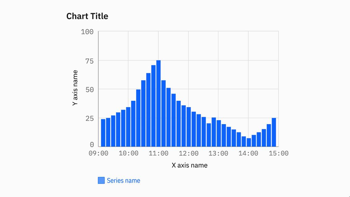
The title should reflect the main insight the data reveals. The legend should explain the chart’s meaning by defining the association of each visual property, such as color, shape and size, to the corresponding data. When possible, use labels directly on the chart to avoid long legends. All the text should be concise and easy to understand. Learn more on Carbon.
Concise title
Long and too descriptive title
Axes, ticks and grid
Axes, ticks and the grid should help the reader understand the proportions and scale of the data, the indicators involved and their unit of measure. Avoid filling the chart frame with too many elements, as it impacts the user’s ability to interpret the data. Learn more on Carbon.
Use the correct density of grid lines and labels.
Don’t use too many elements or the chart will be difficult to read.
Color
The application of the IBM color palette brings a unified and recognizable consistency to the array of digital products and interfaces. This color pallette applies to data visualization, as well, but isn’t restricted to appearance only; it decreases recognition times, conveys meaning and helps users make faster, more informed decisions. When designing IBM’s data visualization, be sure to maximize accessibility and harmony, but also keep an eye on cultural and psychological contexts.
Emphasize the story you want to tell
Color is one of the most powerful sensory cues and a highly influential visual property. Create a sharp contrast between elements to focus the user’s attention on the meaning of the chart, but be essential—every color should have a reason for being there. Conversely, even the absence of color delivers information.
Shades of grey ensure data points are visible while not distracting from the key insights. On the other hand, connecting specific colors to certain key metrics helps your audience easily recognize frequent indicators.
Improve readability and hierarchy of elements
Caring about contrast means caring if users will be able to read your chart on their screens, even in low light and if you use shades of colors like light grey. Well-chosen colors reduce the time for viewers to gain insights and help them understand the message sooner. Rely on categorical palettes if you want to maximize contrast between data that doesn’t have an inherent relationship, while sequential palettes are good to show relationships or hierarchies between data. Reinforce color meaning with other strong visual features, like shape, line or pattern, to make the focal point immediately recognizable.
Represent quantity
Color can convey meaning. By illuminating a chart through sequential or diverging palettes, you add depth and dimension to specific data, drawing attention to the quantitative aspect of the story.
Texture and markers
Visualizations can be rich and “colorful,” even in situations when color can’t be used. IBM employs different shades of black, together with patterns and markers, as a valid substitute for color. Patterns aren’t just a decoration, but become a way to convey information. Use lines with different weights and play with the density of elements. Learn more on Carbon.
Interaction
At IBM, we’re curious. When we think something should be explored, we follow that impulse and see where it leads. Thus, we want our data visualization audience to explore problems from multiple perspectives with interaction patterns like searching, filtering or highlighting.
Interactivity is an essential feature that turns your visualization into a tool to foster data exploration and improve user understanding by creating recognition, shortening the learning curve. A visualization reaches its maximum value when it allows users to find their own exploration path.
Overview first, zoom and filter, then details on demand
We want data visualization to present crucial points clearly and prominently for quick and easy reading, providing clear insights while still giving the user the option to get more information on demand at any time. Don’t hide important information behind an interactive behavior. Interaction should support analytical reasoning and user comprehension by revealing context, insights, associations and causality. Learn more on Carbon.
Motion
Motion is a powerful tool in designing and building communication and user experience. We use data visualization to communicate relationships between elements and make changes in the data set or on the environment explicit, clear and unambiguous. Consider the entrance and exit motions to enhance the visual hierarchy of elements, orientation of axes and the data displayed. Be careful not to communicate contradicting information with different transitions. Learn more on Carbon.
Animation emphasizes changes.
Animation hides connections.


