Line style
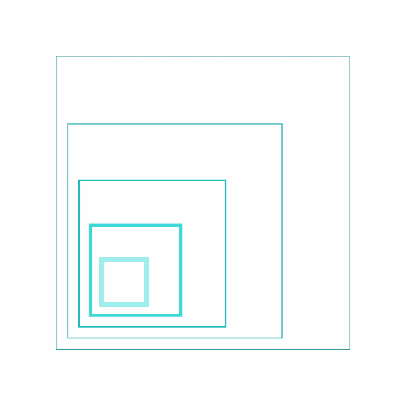
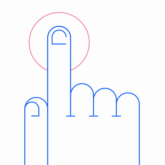
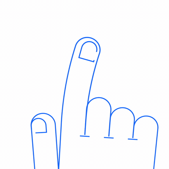
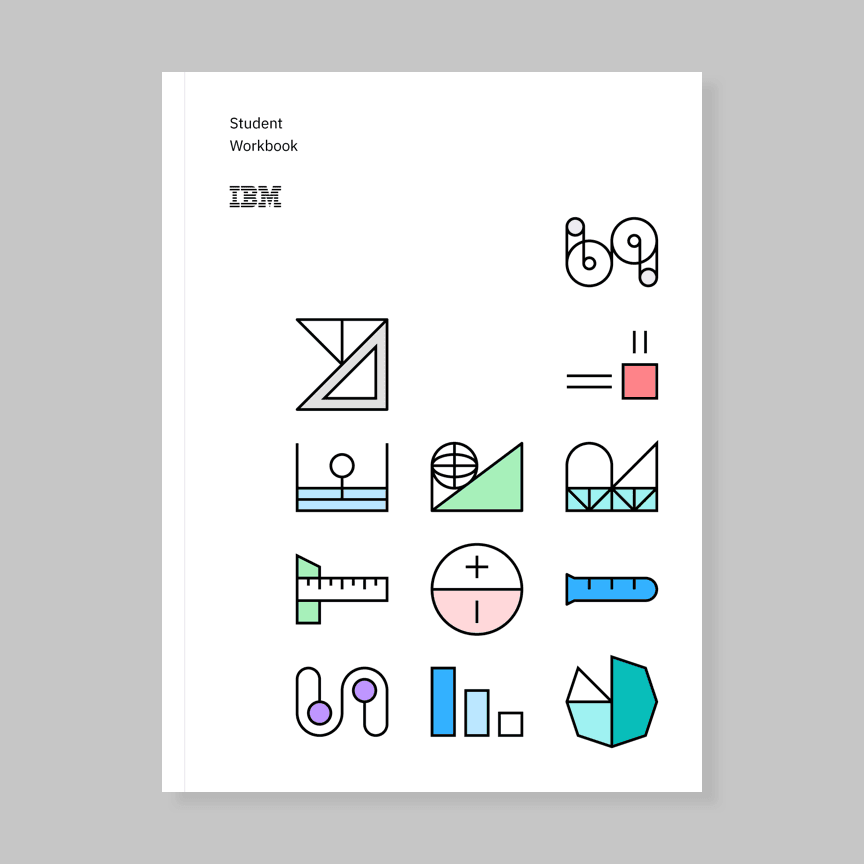
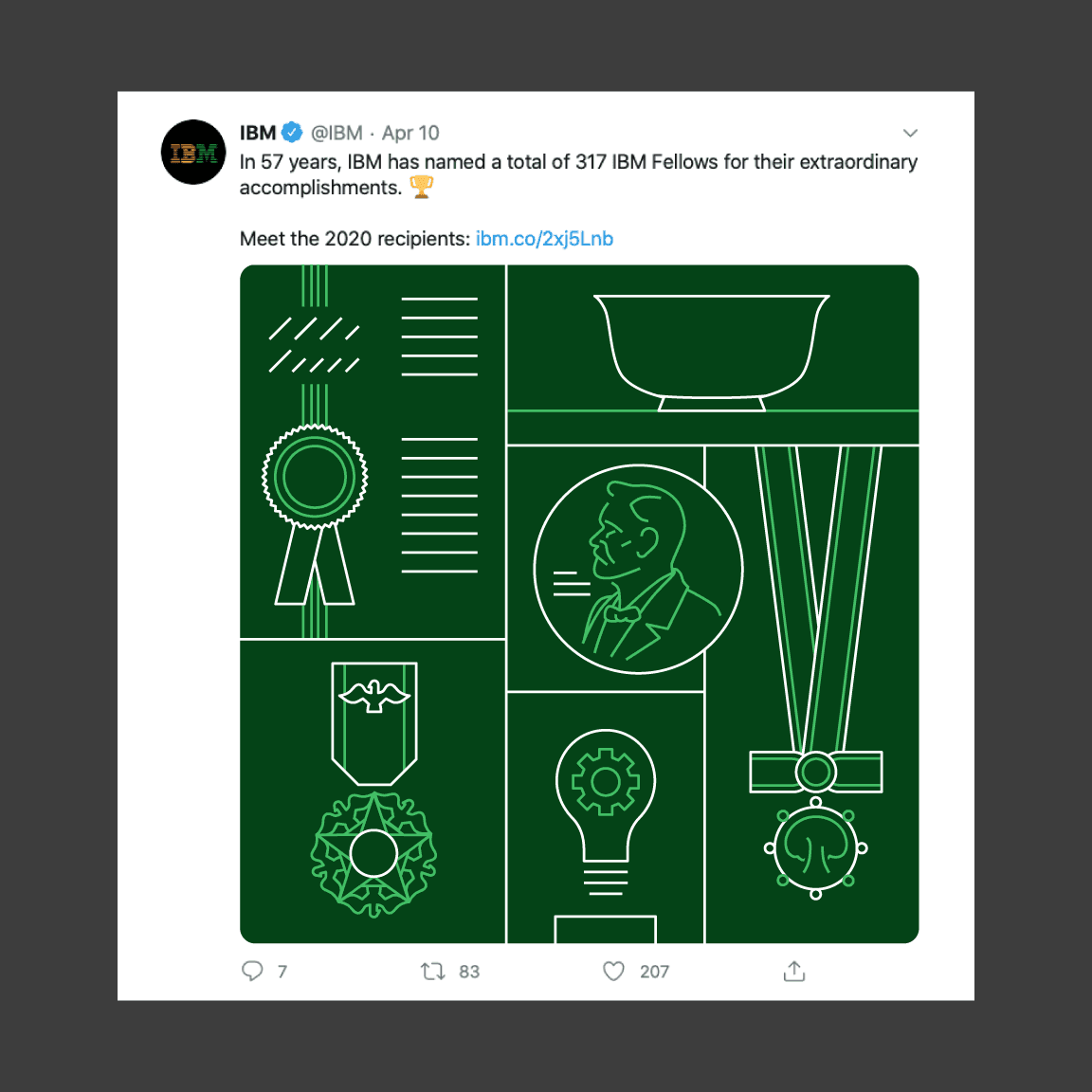
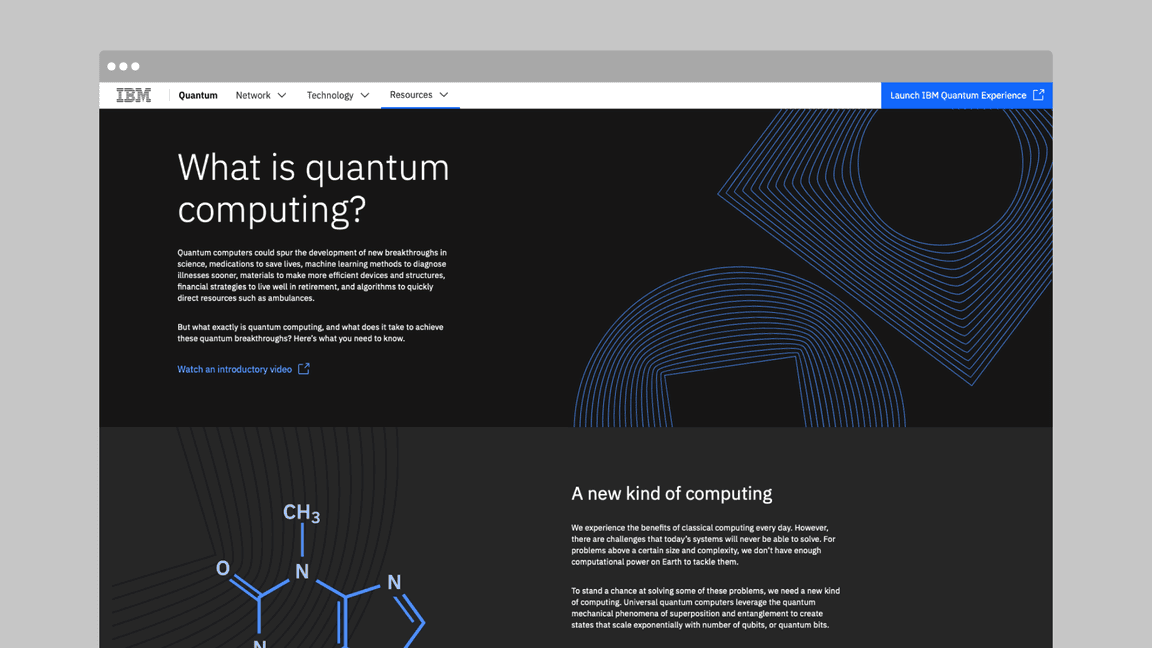
We apply line style effectively across many formats—from technical drawings to spot illustrations to extended multimedia campaigns that support complex narratives. Its light and airy quality suits more subtle visual expressions, while its precise and engineered nature ideally expresses diagrams and more detailed scenarios.
Examples in use


Animation
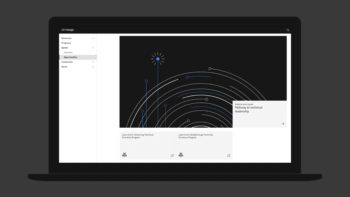
The forthright construction and reduced aesthetic of line-style animations lend themselves particularly well to deftly applied stroke effects and geometrically driven animation.
Tips
- Keep shapes true to the original design. Be careful of custom path animation
and rely on
position,rotationandscale. - Ensure gradients track with strokes as they move through the frame.
- Apply simple camera moves on rare occasions, but only if they further the message.
- Utilize shape layers in Adobe After Effects to create rectangles and circles to maintain flexibility, while ensuring precision.
Gradients
Gradients can add interest to uncomplicated animations but can be technically challenging to execute well. When illustrating for motion, avoid creating or animating complex gradients unless they’re necessary to convey the message.
Use gradients if they’re relevant to the concept.
Avoid complex gradients if the message can be conveyed without it.
Offset and overlap
When offsetting the movement of objects, it’s crucial that we prevent overlapping linework. Closely offset elements feel guided and finely choreographed. Conversely, overlapping strokes create an impression of busyness and disorder.
Choreographed offsets on each object create visual interest.
Avoid overlapping objects.
Design-first performance
In general, line illustrations that depict faces, hands or the anatomy can feel alien and rigid when animated with realistic movements. Instead, lean into the graphic nature of each composition, animating the underlying graphic shapes to gesture at realism, without closely imitating it.
Here’s a graphic interpretation of human performance.
Overly fluid performances degrade the design.


