App icons
Follow the design and production guidelines found here when making a new app icon. Secure required approvals from the Design Language team so that your new app icon can be added into the icon library.
- Design and production guidelines
- Making an app icon
- Exporting SVGs for product and web
- Exporting for native OS
- Approval process
Resources
Design and production guidelines
Don’t see a useful, available app icon in the master? Make your own! Follow these guidelines to ensure visual consistency and proper formatting.
- All app icons should be unique and not redundant with any existing app icon in
the system. Look through the icons in the
App_Icon_Master.aifile from the app icons repo to ensure that your proposed new icon won’t be confused with other app icons. - All app icons should adhere to the IBM Design Language visual style.
- All app icons should comply with IBM accessibility standards.
- All app icons should be usable across all supported platforms and devices.
- All app icons should be understandable by a global audience of users, regardless of nationality or language.
Making an app icon
- Create a 32 x 32 px artboard for each app icon. The
App_Icon_Builder.aifile on the app icons repo provides proper specs and grid lines. - 32 px app icons should have 2 px padding.
- Set your workspace up from the start to snap to pixels.
- Be aware of automatic alignments which can place vectors on uneven or half pixels.
Stroke app icon masking
Stroke app icons feature both color and alpha channel gradients. This technique can be achieved in Adobe Illustrator using masking. Follow these guidelines to create proper gradient masks.
- Draw a 32 x 32 px square and apply a color gradient. Set the angle to 45° and place the gradient slider locations at 10% and 90%.
- Place the artwork to be in color above the color square. Make sure the color
is set to
#FFFFFFwhite. - Place black gradients on the parts of the icon to be masked. Set both
gradient sliders to
#000000black, and set one slider to 0% opacity. Any part of the artwork in black will be transparent after masking.
- Open the transparency panel
Window→Transparency. - Group all gradients with the white icon
Object→Group. - Select both the new group and the color square, then click
Make Maskin the transparency panel.
Exporting SVGs for product and web
To be considered production-ready for product and web, confirm the following:
- All artwork and artboards must be aligned to the pixel grid.
- All strokes must be expanded
Object→Expand. - All possible shapes and paths should be combined.
- Use only linear gradients. Do not use conical gradients, radial gradients, or gradients along stroke.
- For stroke app icons, use the masking method described in the previous section. Do not use clipping masks.
- If your icon is not a stroke app icon, then you will need to place a 32 x 32 px transparent square background on each artboard. This square should have no fill or stroke to ensure that the icons maintains a squared size.
App icons for product and web are created for all background types. This ensures your icon will be accessible in any UI context. Note that these SVGs will work in product and web, but may not render correctly in Sketch. For designing in sketch, export as PNG.
- Download the
App_Icon_Builder.aifile from the app icons repo. - Following app icon guidance, create the following 4 versions of your icon: dark theme, light theme, monochromatic dark theme, monochromatic light theme.
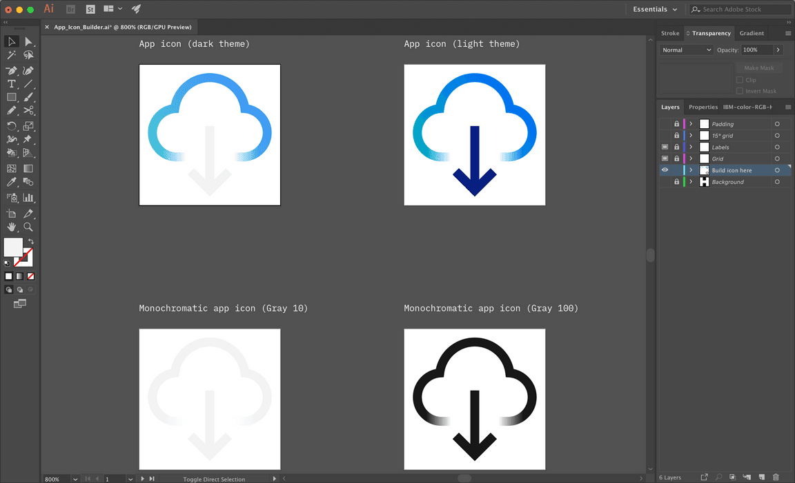
- Make sure your background layer is turned off.
- Select
File→Export for Screens...from the top navigation. - In the
Formatssection, click the gear icon to openAdvanced settings for exported file types. SelectSVGand enter the following settings:
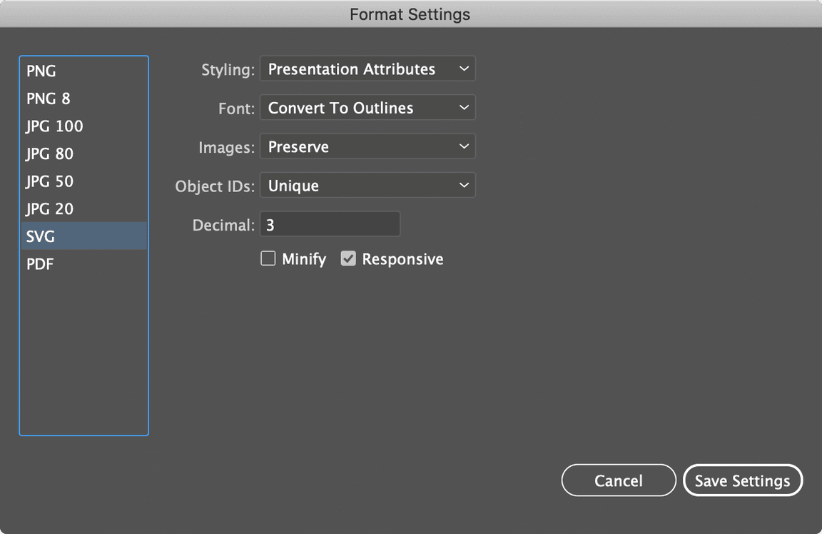
- In the
Formatssection, select the SVG format. - Click
Export Artboard. Your file will export to SVG.
Exporting for native OS
The app icon template makes it easy to export native app icons for any environment at every size you need. Refer to the read-me file in the template to automate your export process, or follow the guidance here to export manually.
- Download
App_Icon_Template.zipfrom the app icons repo. - Place the 32 x 32 px app icon in the
Place_Icon_Here.aifile. Separate foreground icon elements from background elements and place on the respective artboards.
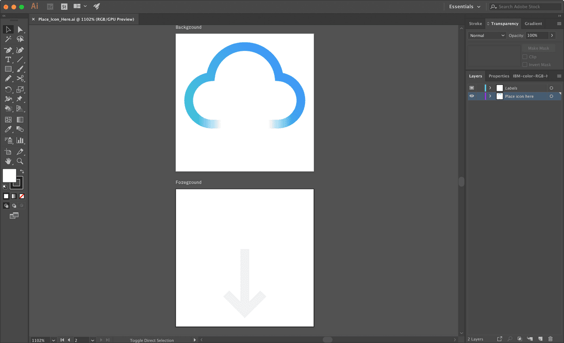
- Create your icon background in the
App_Icon_Background_Color.aifile and save. - Open the
App_Icon_Export.aifile. The artboards should have updated to include your icon. - Select
File→Export→Export for Screensfrom the top navigation. - Select the artboards you need to export:
| Platform | Container shape | Artboard |
|---|---|---|
| iOS, Google Play Store | Square | 01 |
| MacOS | Circle | 02 |
| Circular social avatars | Circle (unmasked) | 03 |
| Windows UWP | None | 04 |
| Android | Custom | 05, 06, 07 |
- In the
Formatssection, click theScaledropdown and chooseWidth.
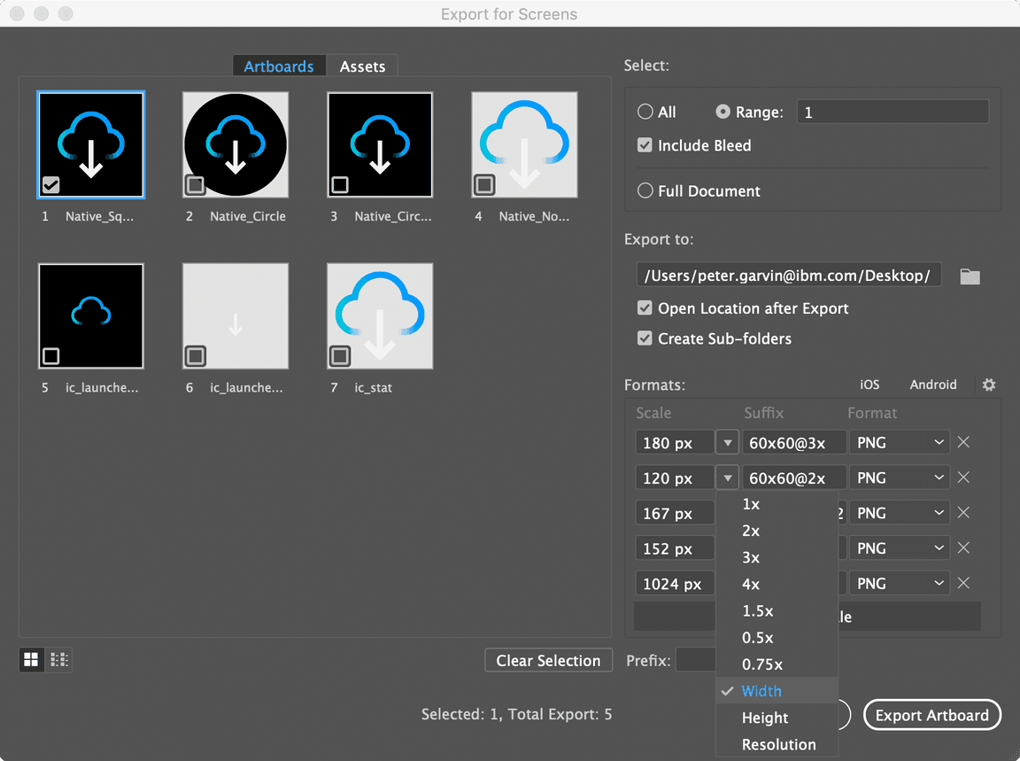
- Enter the final output size for the icon, and add as many scales as needed. Refer to your target platform’s documentation for sizing and naming specs. Here are some common ones:
Android app icons
Android icons are primarily created in the Image Asset Studio within Android Studio, but the source images should be exported from the app icon template. Refer to the read-me file in the template to automate your export process, or follow the guidance here to export manually. For more information on the Visual Asset Studio, visit the Android app icon documentation.
Exporting images
- With your
App_Icon_Export.aifile ready from the previous steps, selectFile→Export→Export for Screensfrom the top navigation. - Select artboards 5, 6, and 7.
- In the
Formatssection, configure your settings to match the table below:
| Scale | Suffix | Format |
|---|---|---|
| 4x | xxxhdpi | PNG |
- Click
Export Artboard. - Select
File→Export→Export for Screensfrom the top navigation. - Select artboard 1.
- In the
Formatssection, configure your settings to match the table below:
| Scale | Suffix | Format |
|---|---|---|
| 1x | -web | PNG |
Importing images to the Image Asset Studio
- In Android Studio, select
File→New→Image Asset. - In the
Icon Typedropdown, chooseLauncher Icons (Adaptive and Legacy). - Import your foreground asset
ic_launcher_foreground_xxxhdpi.pngand background assetic_launcher_background_xxxhdpi.png. Do not trim or resize the artwork. The icon name is optional. - Within the
Legacytab underGoogle Play Store Icon, selectNo.
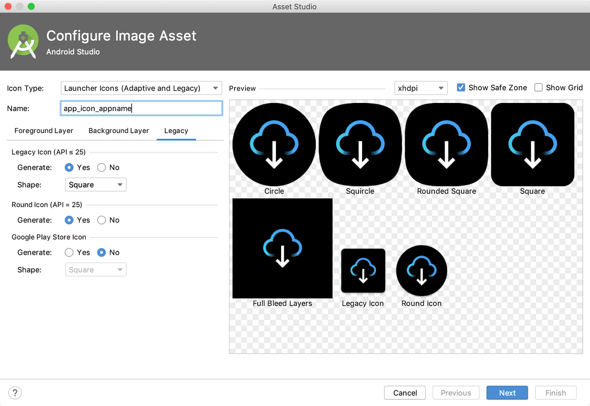
- Choose
Nextto confirm the icon path and selectFinish. - Next, add the notification icon. In Android Studio, select
File→New→Image Asset. - In the
Icon Typedropdown, chooseNotification Icons. - Import your notification asset
ic_stat_xxxhdpi.png. Do not trim or add padding to the artwork. The icon name is optional.
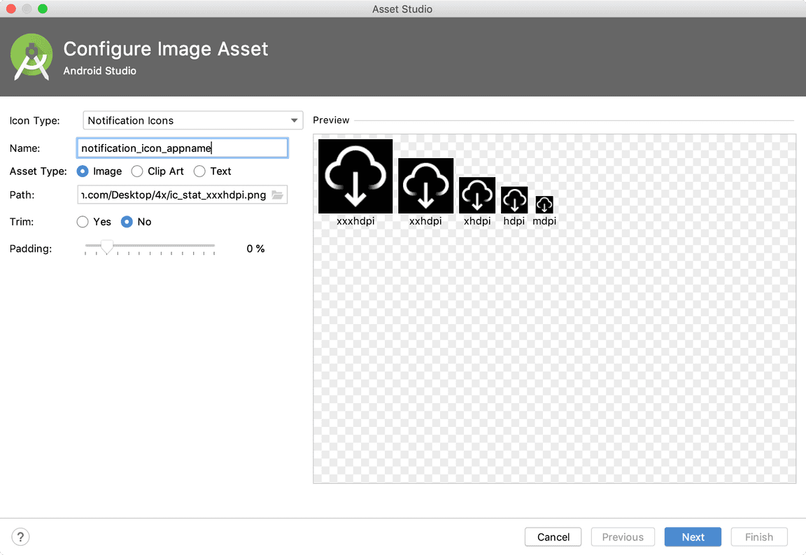
- Choose
Nextto confirm the icon path and selectFinish. - Finally, place the 512 px Google Play Store image within your project folder
at
/app/src/main.
Approval process
App icons must go through a design review process to ensure consistency and proper representation of the IBM brand across all environments.
The process begins when you create a GitHub issue. Design review and approval typically take 14–21 days from issue creation, depending on the number of icons contributed.
If your submission is accepted, the team will assign someone to your issue. If changes are needed, the team will note them in the issue and may return your submission with recommendations or suggest reworking the icon based on feedback from the Design System and Brand teams.
Once the submission is approved it will then go through our process to be included into the IBM app icon gallery. Please submit app icons for approval by creating an issue.
Submission requirements
You must include the following files in your submission (if applicable). App
store image templates are provided within the App_Icon_Template.zip file from
the app icons repo.
Android
- Completed
App_Icon_Builder.aifile - 512 px Google Play Store image
- 1024 x 500 px Google Play Store Feature graphic (you may submit your own or choose an existing one)
iOS
- Completed
App_Icon_Builder.aifile - 1024 px Apple App Store image
Product and web
- Completed
App_Icon_Builder.aifile - SVGs for all versions of your icon: dark theme, light theme, monochromatic dark theme, monochromatic light theme
MacOS, WatchOS
- Completed
App_Icon_Builder.aifile - 1024 px Apple App Store image
Windows UWP
- Completed
App_Icon_Builder.aifile - 16:9 super hero art
- 3:2 poster art
- 1:1 box art


