Tips and techniques
Illustrations can move a viewer from one point of view to another instantly. Ways of seeing them vary from abstract to literal, from micro to macro and more. The intent of a piece helps determine a framework and canvas, while considered use of color provides deeper meaning. Use these tips and techniques to build powerful illustrations.
Ways of seeing
There are many ways of communicating ideas with illustrations. Some are more literal, some more abstract, some zoomed-in, some zoomed-out while others require more fidelity to capture and convey the details. Whatever the best strategy, IBM illustration styles have been developed with this diversity in mind so that you can determine which approach best depicts the concepts or the nature of the subject.
Abstract and literal
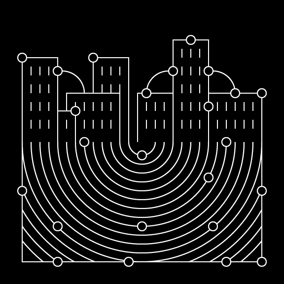
Expressing concepts in abstract ways creates interest and exciting compositions, while literal executions can communicate complicated concepts more clearly. Both techniques are vital for communications with illustrations.

Abstraction is more conceptual and provocative.

Literal expressions are more explanatory and utilitarian.
Micro and macro
IBM has a long and rich history of showing systems in micro and macro scales. This ability to communicate in both scales allows us to communicate the hard to see or expansive concepts. These views are critical to illustration techniques and effectiveness.

Micro views zoom into the subject.

Macro views show a larger picture.
Low fidelity and high fidelity
Some illustrations benefit from being simple and direct while others require more fidelity to capture greater detail or offer a dramatic effect. Illumination is always an idea to consider with color and detailing techniques, such as gradients, which can help communicate more vividly.

Solid color is more simple and direct.

Gradients and tone add depth and drama.
Intent
Knowing the intent of your illustration helps create the framework for decision-making. Will it serve as the cover of a brochure, a large wall at an event or support a series of ideas in a website. Illustrations can live within a wide variety of sizes and environments whether digital or physical. There are different types of illustrations used for various purposes at different scales and complexities.
Featured
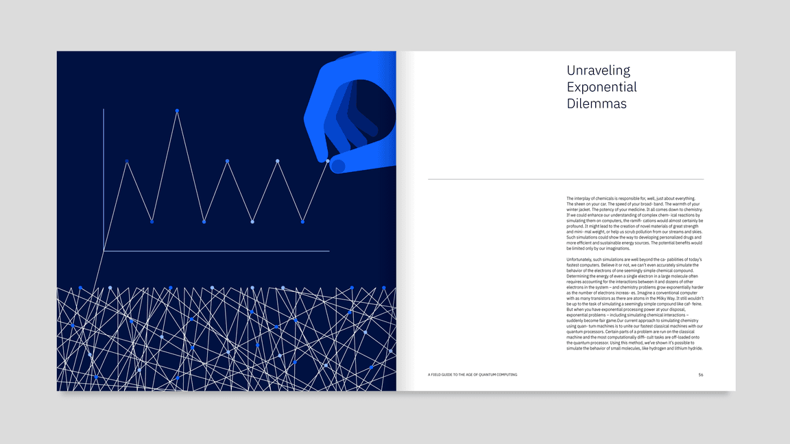
Featured, or hero, illustrations are impactful. These delightful illustrations tell complex stories. Hero illustrations tend to be more metaphorical and intricate than other types of imagery and may use more color, space and elements. While heros are more complex and imaginative, they should remain focused and balanced. Maintaining a sense of professionalism and organization through thoughtful composition is key.
Supportive
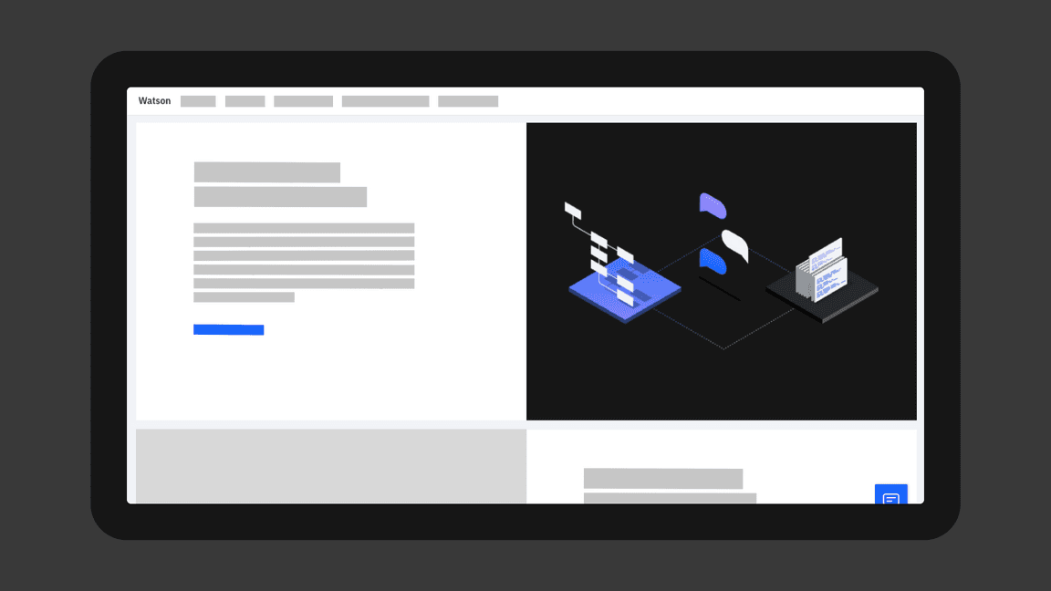
Supportive, or spot, illustrations are simplified illustrations that usually enhance other content. Because they are supporting elements, spot illustrations must be easily read so viewers grasp concepts at glance. Spot illustrations are focused, but maintain a feeling of delight and nimbleness, guiding a viewer through a narrative. Spot illustrations are commonly used in digital empty states, in composition with other spot illustrations or paired with text.
Color
Color in illustration sets the tone, gives meaning and reinforces our brand expression. When choosing colors for your illustrations, consider their association with your particular product or communication. When chosen thoughfully, colors can achieve engaging and delightful results.
The starting point for illustrations should always be the IBM color palette. Adherence to this palette creates brand consistency and distinction. When working on specific business units within IBM, please reference the individual brand guidelines for more detailed color guidance.

Color schemes
There are many different ways to combine swatches from the IBM color palette, depending on the style and intent of your illustration. Below are a few common approaches to consider.
Monochromatic
Monochromatic illustrations have a simple and direct quality to them and are comprised of tints and tones of a single hue. This tehnique has a logical, systematic and engineered look. Within this scheme, flat or tint techniques can be applied.


Analogous
Analogous colors bring a harmonious quality by using neighboring hues from the palette. This technique adds subtle depth, movement and fidelity to an illustration. Two to three hues work best for this technique. Additional colors will likely add unnecessary complexity and should be avoided.


Complementary
The opposing nature of complementary colors create vibrancy and tension, which can be quite effective when you want to draw attention to an element. Large fields of complementary colors can be quite jarring, so it’s best to use them as accents that bring just the right amount of contrast and life to an illustration.


Use of blue
Be cautious when using blues in an illustration that could potentially compete with other elements that are also blue, such as UI buttons and other focal points.

Do choose colors that maintain clear delineation around focal points.

Don’t use an abundance of blue that may obscure important UI elements.
Additional colors
In some cases, additional colors will be required to achieve a more realistic illustration. In general, orange and yellow tones are reserved for UI alert colors, but may be used, if required. Additional colors should be limited to specific use cases, such as skin tones.
Specific blends of IBM red and green swatches may be used for skin tones.
Yellow is not required to represent the pencil and should be avoided in this case.
Accessibility
IBM firmly believes that all of our experiences should be accessible for everyone, regardless of abilities or impairments. If an illustration conveys information not entirely captured in accompanying text, the main concepts must meet 3:1 AA accessibility standards. Always be conscious when choosing colors to give every user the same experience, regardless of ability.

Colors pass with 3.9:1 contrast ratio.

Colors fail with 2.1:1 contrast ratio.
Canvases
Use common aspect ratios, such as 16:9, 4:3, 3:2, 2:1 and 1:1, for illustrations unless otherwise dictated by specific platform requirements. These helpful aspect ratios also correspond well to the resolution, scale and line weights. These common aspect ratios work well with our 2x Grid, creating a visual rhythm across everything created using IBM Design Language, from our components and formats to signage and event spaces and more.
Composition
IBM has very specific guidance around composition. The following tips show how to best compose your ideas into distinct and successful illustrations. Visit IDL Layout guidance for more detailed information about composition.
Framing
The 2x Grid can be a useful guide when composing illustrations. Images should leverage divisions of two. Either horizontal or vertical, these divisions create zones for different kinds of representations. For example, one area could show a literal object while the adjacent area could reveal what’s happening digitally or behind the scenes.

Two sides

Horizons
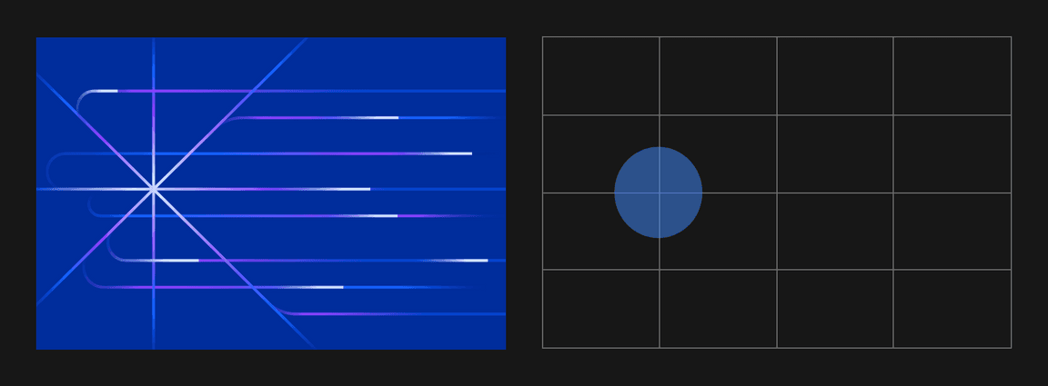
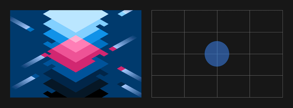
Focal points
Use the 2x Grid to establish clear focal points. It may seem prescriptive, but when seen together, this approach acts as connective tissue between IBM illustrations. The same approach is used to create delightful animated experiences.
